True Data Driven Web Design
READ
To me, nothing beats the feeling of launching a new website. When you point that A Record, watch the propagation across the internet, and see that new page resolve when you refresh your browser on all of your devices.
Ahhhhhhhhhh.
The new website. No matter how many pages or how much web traffic a site gets, it's always a big feeling for us. Case in point, launching the new TwiceDaily.com. This was a big one for me, for many reasons.
- The great people I was able to work with on this project. Our team, made up of Chris Toomajanian (lead developer) and Kate Hickey (project manager and content strategist), with some help early on from Bailey Robbins (content strategist) and Leah Toomajanian (designer), worked with an amazing client team at TriStar Energy, LLC, made up of Dawn Boulanger (VP, Marketing), Christy Cox (VP, Human Resources), Anessia Griffin (Marketing Manager), Ken Buettner (VP, Information Technology) as well as Scotty Creason and Paul Neights from Information Technology and David Smith, Manager, Talent Acquisition. Also, a special thank you to Brian Bruzewski of DoubleBee Photo for joining our team at a few on-site photo shoots and providing top-notch imagery for the website. I also need to mention the fact that this was an amazing team effort by the TriStar Energy Family, allowing access to all of their wonderful employees, from the hosts/hostesses and cashiers at Twice Daily stores, all the way up to the executive team.
- Multiple Target Audiences. There were many goals that needed to be accomplished with this project. First, a well-respected high-quality convenience store brand in Middle Tennessee needed an elevated web presence - one that helped customers find their 80+ stores, learn about their fresh food offerings, and commitment to their guests to provide the best assortment of quality food and refreshments for both morning and afternoon visits. And of course, any deals and rewards programs that help get people in from the pump to the store. So, we'll obviously be setting up Google Analytics Goals that inform us of these potential actions. That's probably the one most people think of when they envision this project from the outside. But another major goal that arose during the course of the project, was recruiting top notch employees to work at Twice Daily stores. This is where the new Careers website came into play. Telling the story of the amazing team at Twice Daily and creating a digital experience that allows TriStar Energy to cast a wider net and have prospective employees have the most seamless experience possible learning about the brand, experience, benefits, career opportunities and most importantly - apply online.
- The Process. If you've ever worked really closely with me, you know that I hate "process." Process can really slow things down. But the kind of process I hate is one that is not productive. I hate the typical agency type of process that bogs things down with unnecessary roles and responsibilities, meetings and check-ins, and worst of all for the client - change orders and timeline extensions. But this project was an extra special example of how we implement our Data Driven Design process of:
1. Looking at legacy Google Analytics Data First to Inform Web Design Decisions and Focus Areas.
2. Identifying focus features and functionality.
3. Providing the best possible facilitation of communications between all parties.
4. Working on enhancing the website along the way via UX/UI Q/A and copywriting.
5. Quality SEO, Security and Site Health Launch Process. The best example of using data to drive design on this project, is our early findings that over the last two years, 85% of web traffic to TwiceDaily.com views the website on a mobile device. I can tell you from looking at hundreds of Google Analytics accounts a year that this number is extremely high. Despite everything "trending mobile," most websites have about 15-30% of their web traffic viewing on a mobile device. Without this insight, we might have focused most of our efforts on the desktop version and simply implemented a typical "responsive web design" that looked good on all devices, including mobile phones. However, on this project, we focused around designing a special mobile navigation that calls out the key points on both the consumer / guest site and the careers site, as well as prioritizing the "Find My Twice Daily" Call to Action, making it easy for customers to find stores. We'll be tracking the effectiveness of this, of course.Among other insights from the data, this, gives us extreme confidence that we will lower the bounce rate significantly from the legacy site's 85% bounce rate due to a lack of mobile responsive design and other factors related to the main navigation.We also did a comprehensive competitive analysis, looking at competitor data and marrying that together with legacy Google Analytics data from TwiceDaily.com to determine the main navigation, where to place main Calls To Action, pixel height on hero imagery and several other UX/UI design decisions.Here is a look at the before and after on TwiceDaily.com mobile / desktop.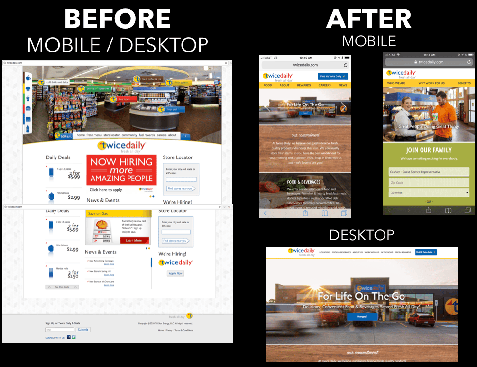
- A Few Extra "Bells and Whistles." This new TwiceDaily.com may look like your typical brochure website at first, but use it a few times and you'll see it's not. Dig a little deeper and you'll see an optimized store search for both mobile and desktop, with autofill, a conscious decision NOT to enable location services under the assumption that the closest store is actually the one that the user wants to find. Data shows location enabled features aren't used as much as allowing the user to actually perform the search. The job search functionality with API integration on the applicant tracking system was crucial to this project from a Careers site standpoint. We elevated the job search capabilities and applied multiple search filters, by job type, zip code radius and even store number (due to the fact that this is the "boots on the ground messaging from employees at the store level to job candidates who walk into stores asking to apply for jobs.") Making all content editable in WordPress is always key for us, and a couple data points for the future: We implemented heatmapping code along with Google Analytics Engagement Goals upon launch to be able to come back post launch with proactive Data Driven UX/UI improvements once we have real traffic numbers flowing to the new site. (We're not guessing).
So as the A Record Changes, it feels good, but now is where the real work begins. Now is where we start to track and measure the achievement of the business goals related to this project. Best believe I've pumped about that part too!
Kudos to everyone mentioned at the beginning of this article for bringing this all together.
Of course, while we are proud of this project and all projects we work on, we're certainly not perfect, so if you see anything about this or any of our sites that can be improved, please email me at paul@datadriven.design.
Thanks for reading and have a great day!
Paul Hickey has created and grown businesses via digital strategy and internet marketing for more than 10 years. His sweet spot is using analytics to design and build websites and grow the audience and revenue of businesses via SEO/Blogging, Google Adwords, Bing Ads, Facebook and Instagram Ads, Social Media Content Marketing and Email Marketing. The part that he’s most passionate about is quantifying next marketing actions based on real data.